Johnston Sans: The Tube typeface that changed everything [BBC]
Date: 30/03/2016
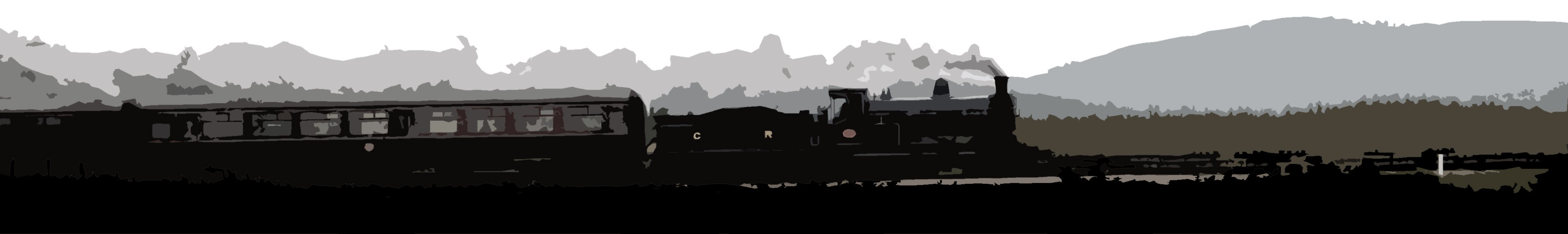
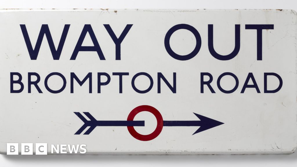
One of today's most popular typefaces owes its inspiration to radical work done for the signage on British transport a century ago. Johnston Sans changed everything. In 1916, a small revolution in communication came about. London's Underground railway ordered a new typeface for its posters and signage from the calligrapher Edward Johnston. He handed over details and examples of letter shapes that would set the tone for printed text until the present day.
External links
The typeface that prompted a small revolution
BBC News Magazine
One of today's most popular typefaces owes its inspiration to radical work done for the signage on British transport a century ago. Johnston Sans changed everything.
Related images

Pared-down departure information in the platform subway at Paisley Gilmour Street for passengers in a hurry. Interestingly the font appears to be a type of Johnson associated solely with former London Transport applications: sign maybe sourced from LUL?
Location: Paisley Gilmour Street
Company: Glasgow and Paisley Joint Railway
05/03/2016 David Panton
Location: Paisley Gilmour Street
Company: Glasgow and Paisley Joint Railway
05/03/2016 David Panton

Not perhaps as collectable as a postage stamp with a printing fault,
but the two new signs delivered for the platform extension at
Bishopbriggs, seen here on 19 June, are in a non-standard typeface. ScotRail's font is called Officina Sans Book, with characteristic curves on some verticals, such as the top of the 'r'. I don't know what this plainer typeface is, but it's not the Helvetica still commonly found.
Location: Bishopbriggs
Company: Edinburgh and Glasgow Railway
19/06/2010 David Panton
Location: Bishopbriggs
Company: Edinburgh and Glasgow Railway
19/06/2010 David Panton

Balmossie (the 'Halt' was dropped in 1983) opened in 1962. It was
presumably not thought worth ordering proper totems, though someone went to some trouble to get the shape of these wooden substitutes just right. Very little trouble, however, was taken to get the rest of it right. Even the British Rail image signs which replaced them were wooden, though as I remember some effort was made to reproduce the Helvetica typeface.
Location: Balmossie Halt
Company: Dundee and Arbroath Railway
// David Panton
Location: Balmossie Halt
Company: Dundee and Arbroath Railway
// David Panton